Adding personality
Primary colour palette
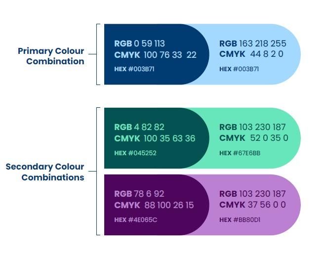
The three core colours remain the same: Dechra Blue, Black and Grey.
These colours are at the heart of the Dechra identity and should be used wherever possible, with particular emphasis on the use of Dechra Blue.
Updated secondary colour palette
The secondary colour palette reflects Dechra’s new brand positioning ‘The Veterinary Perspective’ – embodying their specific tone of voice and personality.
This confident, mature and versatile colour palette can be easily interchanged, complementing the hues of the photography.
These colours should be used within market-facing communications, such as print advertisements, social posts, display advertisements, digital assets and presentation materials.
The brand colours should be used in all brand-led assets.
Any of the Dechra brand colour combinations can be used for digital and print materials.
The colours must be used in the specified combinations and not combined. E.g, Do not place pale blue text over dark green background.

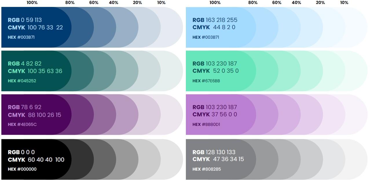
Brand colours should be used at 100%, however, it is possible to utilise tints at lower percentages for secondary graphics, such as graphs or charts. These should be used at the percentages indicated below and not combined in a gradient.

