The Dechra logo
The Dechra logo should always be clearly visible against the background and never include a drop shadow.
The minimum size the Dechra logo can be used with is 25 mm height.
The Dechra logo can only be used in white or Dechra blue or in black for mono use.
![]()
Logo
positioning
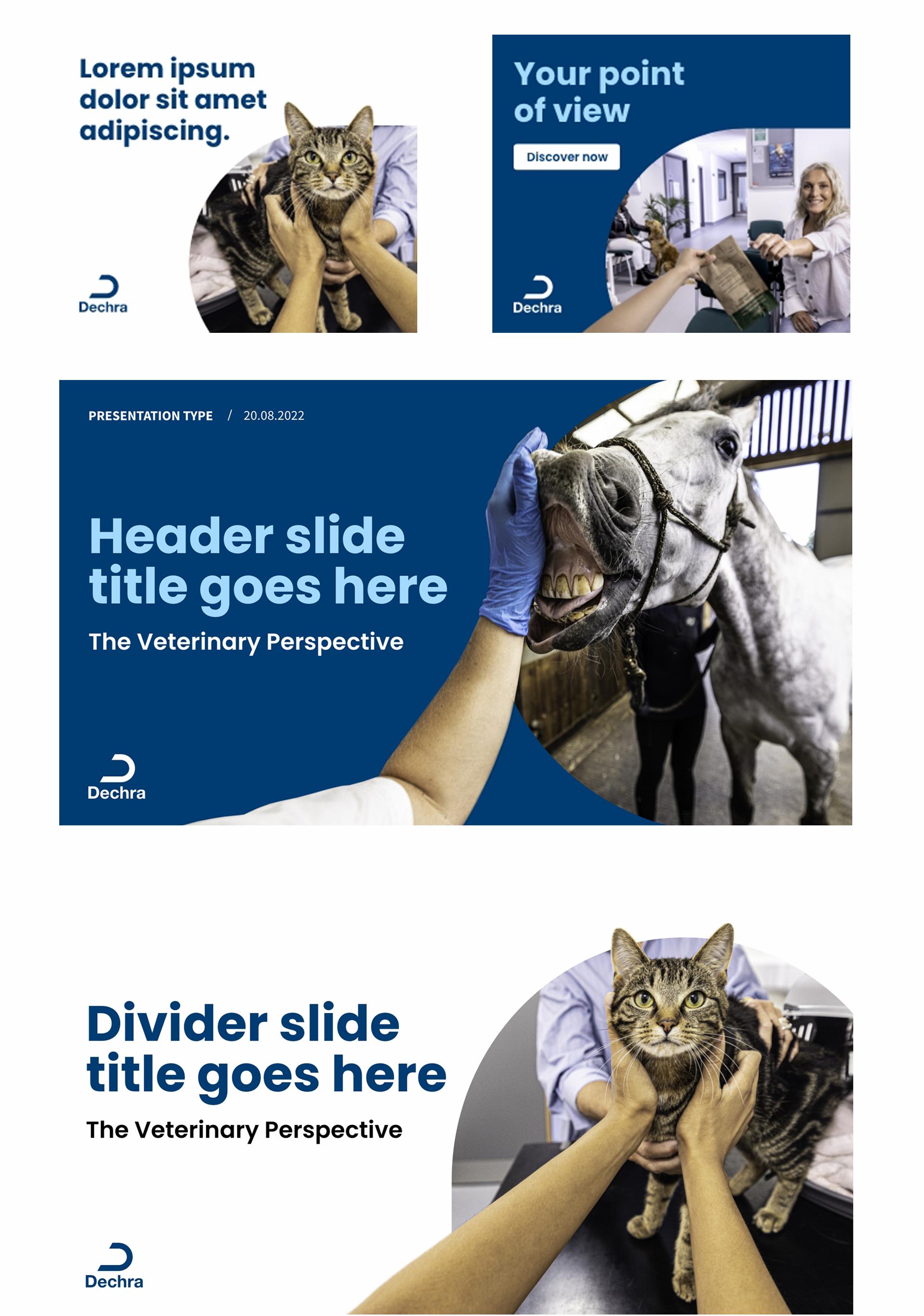
The logo should sit in the top-left corner wherever possible. However, there are often situations where this isn’t possible and there is some flexibility to suit the design. In this case, you should position the logo in the corner of the document (top right, bottom left or bottom right corner.)
The Dechra logo must never be used in the center.
Product logos, therapy area logos and/or the Academy logo can be included in addition to this, but these must be smaller than the lead Dechra logo and positioned in one of the other corners. In this case, all associated logos can be treated in white, and placed over a Dechra brand colour to adhere to the Dechra brand guidelines.

How not to use the Dechra logo
![]()
Logo use within video
Throughout all video content, except at the very end when the logo takes centre-stage, the Dechra logo should be present in the top-left corner (never the bottom-left corner, as this could be obscured by captions).
The width of the Dechra logo should always be 10% of the width of the video. For a standard 1920x1080px video, this means the logo should be 192 pixels wide. If the ‘D’ is used on its own, it should be the same size (i.e, 10% of the width of the ‘D’ in the consumer-facing logo).
The ‘D’ part of the logo should always be positioned 5% of the total video resolution away from the borders. For a standard 1920x1080px video, this means the ‘D’ should be inset 96 pixels from the left, and 54 from the top edge of the video.
As standard, the logo will be white, at 100% opacity. However, when the top left corner of the video is also white, or light enough to make the logo hard to see, the logo can be switched to the navy version.
![]()
Each piece of video should end with the Dechra logo, in the centre of the screen, on a solid colour background. The colours chosen here should cohere with the colours chosen for any brand elements seen throughout the rest of the video, see the colour page for permitted colour combinations.
The short logo animation provided should be used where possible, but a static image of the logo is also permitted.
Any additional information (calls to action etc) should appear in the previous scene, before the logo animation begins.