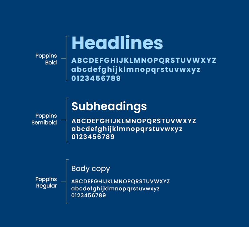
Typography
Our brand typeface is ‘Poppins’ which is available to download here.
This should be used in accordance with the brand guidelines type hierarchy.
Poppins font should be used without exception, unless unavailable in the chosen language. For example, in the instance that the language is Korean, please replace Poppins with Noto Sans KR. For any other specific requirements, please contact brand@dechra.com
Text size should always be clearly legible and adhere to the text ratios outlined in the brand guidelines.
For example, headlines should be in a larger point size than any subheadings, and body text should be smaller again.
Colour in type
As previously mentioned, the new Dechra brand colours are versatile and can be used in a multitude of different combinations for graphical elements. However, using coloured type requires a few rules to ensure that the text is legible. See examples for AA accessible colour combinations:
Light blue headlines
White body copy on blue.
Deep blue headlines
Black body copy on white.
Light green headlines
White body copy on green.
Deep green headlines
Black body copy on white.
Light purple headlines
White body copy on purple.
Deep purple headlines
Black body copy on white.