Accessibility Quick Wins Guide: Enhancing Design for All
At Dechra, we are committed to creating inclusive experiences for all customers, regardless of their abilities. Ensuring that both our digital and print materials are accessible is an essential part of our design process. By making small adjustments, we can improve the usability and reach of our brand across all platforms. Here’s a quick guide to incorporating accessibility into your designs.
Digital Accessibility
Enhancing accessibility on websites, e-learning platforms, and other digital formats helps ensure that everyone can engage with your content. Follow the guidelines below to create more inclusive digital experiences, aligned with WCAG 2.1/2.2 standards.
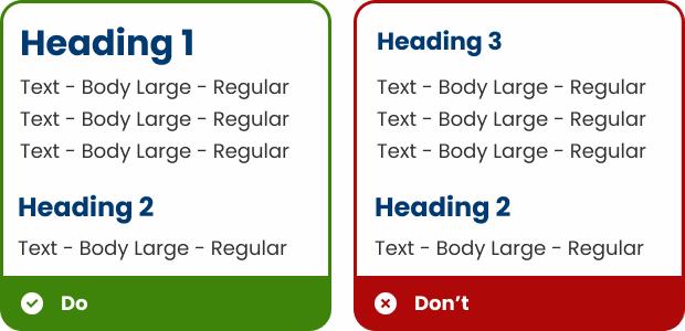
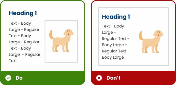
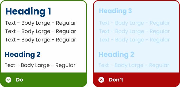
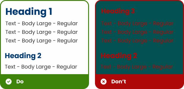
Type Hierarchy
- Why: Screen readers use heading tags to structure and announce sections, allowing users with visual impairments to jump to relevant sections quickly.
- Action: Organize content with HTML heading tags (H1, H2, etc.) to help screen readers navigate and users scan content easily. It is best practise not to skip Heading levels so H1, H2, H3 etc.
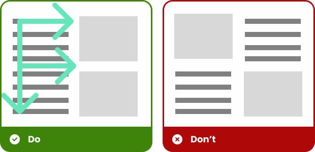
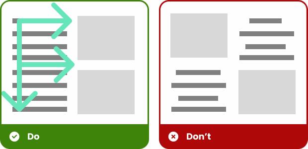
Layout, Reading Patterns, and Visual Hierarchy
- Why: This helps all users—especially those with cognitive disabilities or screen magnifiers—easily find key information without confusion.
- Action: Follow common reading patterns, such as the F-pattern, and place important information at the top or left of the page. Establish a clear visual hierarchy with headings, subheadings, and logical grouping of information. Text should be left aligned in most cases, try to avoid centre aligned or justified text.
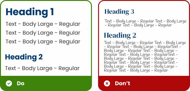
Typography and Spacing
- Why: Increases readability for users with visual impairments or dyslexia, and ensures that content remains usable when zoomed in.
- Action: Use legible, sans-serif fonts like Poppins or Arial, with a minimum font size of 16px and 1.5 line spacing. Ensure text can be resized without disrupting the layout.
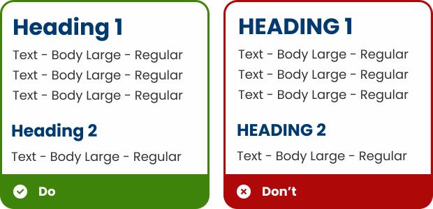
Sentence Case
- Why: Block capitals are harder to read and interpret, especially for users with reading difficulties or dyslexia.
- Action: Use sentence case or title case rather than block capitals for body text, headings, and links. While block caps might be visually striking, they can be harder to read, especially for people with dyslexia or other reading difficulties.
Glossary of Terms
- Why: Improves comprehension for users with cognitive disabilities or those unfamiliar with industry jargon.
- Action: Define technical terms in plain language to ensure clarity and accessibility for all readers, including those with cognitive disabilities. If using an acronym, ensure that the full term is used in the first instance, with the acronym included in brackets immediately afterwards. This can then be used alone in the following copy.
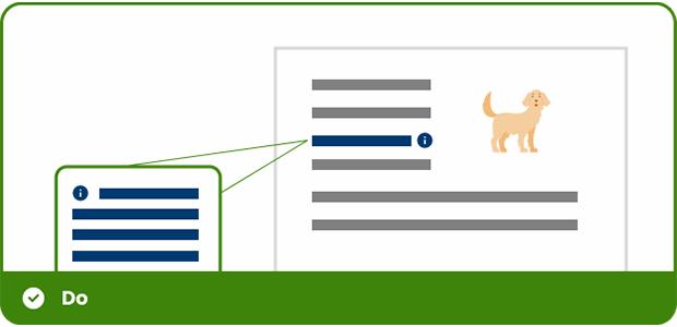
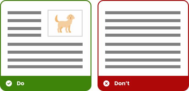
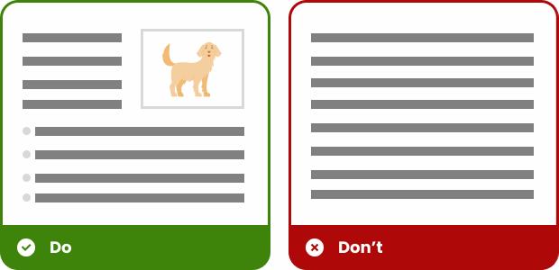
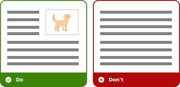
Incorporate Clear Visual Cues
- Why: Helps users with learning disabilities or limited literacy understand content more effectively.
- Action: Use icons, illustrations, and infographics to support and reinforce written information. Visual cues can help individuals with learning disabilities or low literacy better understand the content.
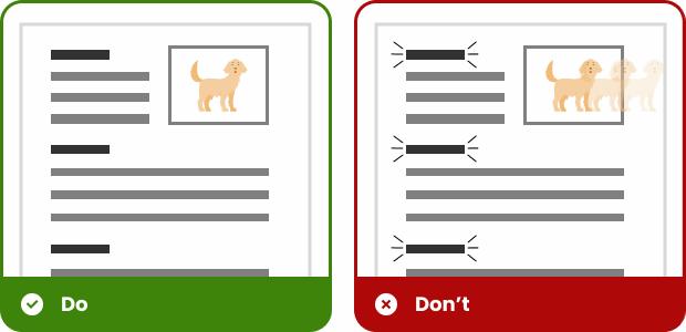
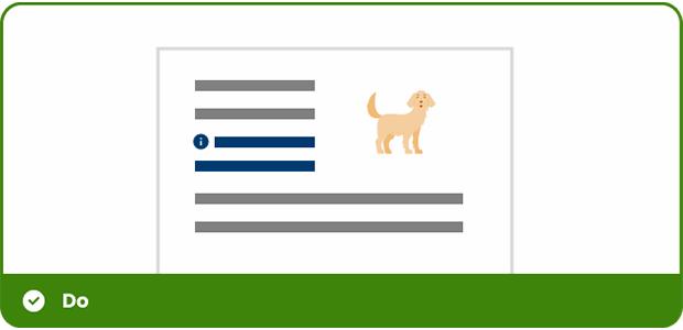
Avoid Text in Images
- Why: Screen readers cannot interpret text in images, making that information inaccessible to visually impaired users.
- Action: Avoid embedding essential text in images as screen readers cannot interpret it. If it's unavoidable, ensure all critical information is included in the alt text.
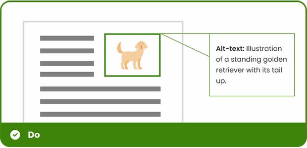
Alt Text for Images
- Why: Ensures that users who rely on screen readers receive equivalent information presented visually.
- Action: Provide clear, descriptive alt text for all images to communicate visual information through screen readers.
- Tool: Use the Alt Text Generator to assist in writing concise and meaningful descriptions. Recommended: AI Alt Text Generator
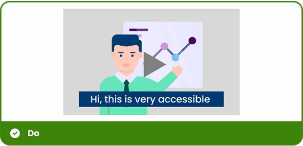
Multimedia Accessibility
- Why: Captions, transcripts, and playback controls ensure that people who are deaf, hard of hearing, or sensitive to sensory input can fully engage with audio and video content.
- Action: Always provide captions and transcripts for video and audio content. Additionally, avoid autoplay, giving users full control over playback.
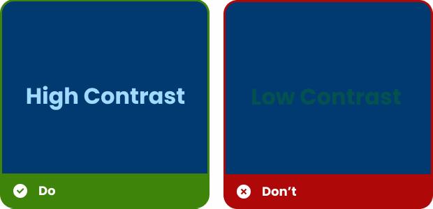
Colour Contrast
- Why: Good contrast improves legibility for everyone, especially users with visual impairments or colour blindness, reducing strain and ensuring that text and visuals are easy to perceive.
- Action: Use high-contrast colour schemes that support readability, while avoiding overly sharp contrasts that may strain the eyes.
- Tool: Use the Contrast Checker to ensure your designs meet accessibility standards. Recommended: WebAIM Contrast Checker
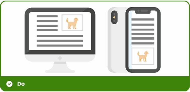
Responsive Design
- Why: People access content on a variety of devices. Responsive design ensures information is accessible and functional no matter the screen size, enhancing usability for all users.
- Action: Design layouts that adapt seamlessly to different screen sizes and devices, from desktops to mobile phones, so content remains accessible on all platforms.
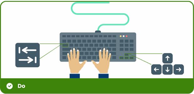
Keyboard Navigation
- Why: Some users rely solely on a keyboard to navigate digital content. Ensuring keyboard access allows everyone to interact with a website or app, regardless of their physical ability.
- Action: Ensure that all interactive elements, such as buttons and forms, are navigable using a keyboard alone, which is essential for users who cannot use a mouse.
Motion and Animation
- Why: Excessive or uncontrolled animations can trigger motion sickness or distraction for users with vestibular disorders or cognitive conditions. Providing control reduces discomfort and improves accessibility.
- Action: Limit the use of animations or moving backgrounds. Allow users to disable animations for comfort, particularly for those with motion sensitivities.
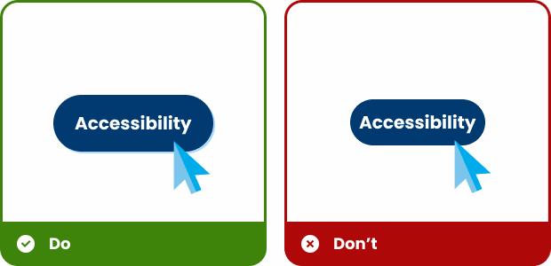
Interactive Elements
- Why: Clearly labeled, easy-to-activate buttons and links help users with motor or visual impairments navigate confidently, reducing frustration and improving usability.
- Action: Design buttons with larger click areas and provide descriptive text for links (e.g., "Learn More about Accessibility"). Make sure interactive elements are visually distinct on hover or focus.
Learn more about padding within CTA's
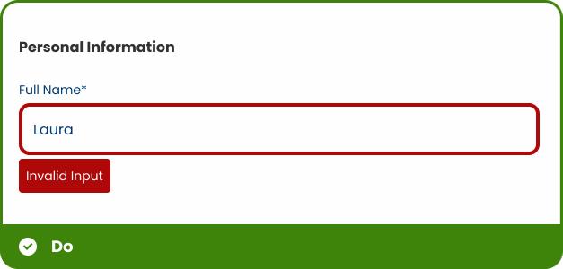
Forms and Error Messages
- Why: Clear instructions and accessible feedback help all users, especially those using screen readers, complete forms accurately and without confusion.
- Action: Label all form fields clearly and provide accessible error messages and instructions for screen reader users to guide them through the process.
Testing and Feedback
- Why: Regular testing and user feedback reveal real-world accessibility barriers that might not be obvious in development. It ensures your design works for everyone, including people with disabilities.
- Action: Test your designs with screen readers, keyboard navigation, and contrast checkers. Collect feedback from users with disabilities to identify any accessibility barriers and make improvements.
- Tool: Evaluate your web content for accessibility issues and get visual feedback directly in your browser. Recommended: WAVE Evaluation Tool
Print Accessibility
Accessible design isn't limited to digital formats. Printed materials must also be inclusive, especially for individuals with visual impairments. Here’s how to make your print designs more accessible.
High Contrast and Legible Fonts
- Why: Strong contrast and readable fonts support individuals with low vision or reading difficulties by making printed content easier to scan and comprehend.
- Action: Use high-contrast colours and clear, sans-serif fonts with body text to ensure readability. Text hierarchy is important to structure content effectively. Implement headings and subheadings to break up sections and guide the reader. Using sentence case for body text enhances flow and readability, creating a more natural and accessible reading experience.
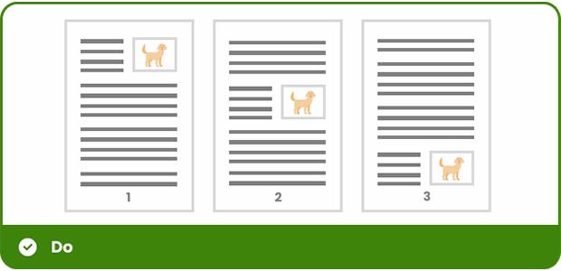
Clear Layouts and Spacing
- Why: Thoughtful layout design breaks down information into manageable chunks, reducing cognitive load and making content easier to process.
- Action: Avoid dense blocks of text. Use infographics to visually represent data or key points, which can simplify complex information and engage readers. Incorporate white space, headings, and bullet points to break up content, improving readability and making the layout feel less cluttered.
Consistent and Simple Language
- Why: Left-aligned text creates a natural flow for readers, especially those with dyslexia or cognitive challenges, making printed content easier to follow.
- Action: Use simple, clear, and concise language throughout your printed materials to ensure ease of understanding.
Clear and Consistent Alignment
- Why: Clear and straightforward language improves comprehension for all readers, including those with learning disabilities or limited literacy.
- Action: Where possible, align text to the left (left-justified) instead of centring it, which can be difficult for some readers to follow. Left-aligned text creates a predictable reading pattern that is easier to scan.
Legible Colour Usage
- Why: Thoughtful colour choices support users with colour vision deficiencies, ensuring that no information is lost due to indistinguishable combinations.
- Action: Avoid using colour combinations that are difficult to distinguish for people with colour blindness (e.g., red and green). Use contrasting colours that are distinguishable by everyone, including those with colour vision deficiencies.
Incorporate Clear Visual Cues
- Why: Visual elements like icons and infographics help convey meaning quickly and support comprehension for people with different learning styles or literacy levels.
- Action: Use icons, illustrations, and infographics to support and reinforce written information. Visual cues can help individuals with learning disabilities or low literacy better understand the content.
Page Numbering and Section Breaks
- Why: Clear structure and navigation markers make it easier to find information, especially in longer documents or for readers using magnification tools.
- Action: Use clear page numbers and section breaks to help individuals navigate printed materials more easily, especially for longer documents.
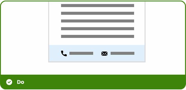
Clear Contact Information
- Why: Easy-to-find contact details ensure users can get help or request alternative formats, creating a more inclusive experience.
- Action: Include clear contact details in a prominent place for those who may need additional assistance, such as requesting accessible formats or asking questions about the content.
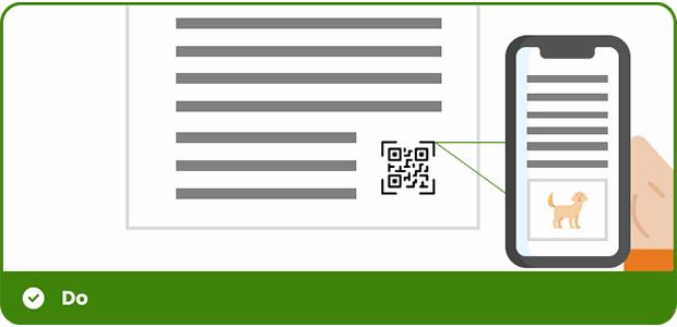
Print Alternatives and QR Codes
- Why: Linking to digital formats through QR codes allows users to access content with assistive technology, bridging the gap between print and digital accessibility.
- Action: Offer print alternatives by incorporating QR codes that link to a digital version of the content. This allows users to access a screen-readable version, enhancing accessibility for those who rely on screen readers. Ensure the QR code is placed in a visible and easy-to-scan location, giving users a seamless option to engage with the content in a digital format.
Conclusion
By integrating these accessibility principles into both our digital and print designs, we can create more inclusive, user-friendly materials. Small changes in our approach can have a big impact on improving the experience for all users. Let’s continue to make accessibility a priority and ensure that our designs reach everyone.
For more information or assistance on accessibility design, feel free to reach out to the Global Digital Team.